CombiROC
CombiROC is a web app for guided and interactive generation of multimarker panels. Click Data in the sidepanel to get started or Accessories/Tutorial for full instructions.
Mazzara S et al. CombiROC: an interactive web tool for selecting accurate marker combinations of omics data. This application was created by the Protein Microarray and Bioinformatics units at INGM. If you have questions or comments, please contact Saveria Mazzara (saveria.mazzara(at)gmail.com). This application was implemented using shiny (for web interface) and other additional R packages (for data manipulation).
Data upload
Enter data
Table
Proteomics demo data
Transcriptomics demo data
Details of uploaded dataset
Mazzara S et al. CombiROC: an interactive web tool for selecting accurate marker combinations of omics data. This application was created by the Protein Microarray and Bioinformatics units at INGM. If you have questions or comments, please contact Saveria Mazzara (saveria.mazzara(at)gmail.com). This application was implemented using shiny (for web interface) and other additional R packages (for data manipulation).
Data Plots
Box Plot
Class A
Class B
Data options
Display options
Label options
Box plot statistics
Box plot statistics
Correlation plot here
Marker Profile Plot (for each individual sample mean fluorescence intensity is displayed)
Mazzara S et al. CombiROC: an interactive web tool for selecting accurate marker combinations of omics data. This application was created by the Protein Microarray and Bioinformatics units at INGM. If you have questions or comments, please contact Saveria Mazzara (saveria.mazzara(at)gmail.com). This application was implemented using shiny (for web interface) and other additional R packages (for data manipulation).
Data pre-processing
Pre-processing options
Table
Mazzara S et al. CombiROC: an interactive web tool for selecting accurate marker combinations of omics data. This application was created by the Protein Microarray and Bioinformatics units at INGM. If you have questions or comments, please contact Saveria Mazzara (saveria.mazzara(at)gmail.com). This application was implemented using shiny (for web interface) and other additional R packages (for data manipulation).
Combinatorial Analysis
Graphics
Click the button to update the value displayed in the plot panel.
Click the button to update the value displayed in the plot panel.
Click the button to update the value displayed in the plot panel.
Mathematical details
The total number of enumerable combinations is:
\[C_{tot}= \sum_{k=0}^{N} C(N,k)=2^{N}-1\]
where N is the total number of items and k the desidered number of components in the combination.
For more theoretical details see:
Combo list
Mazzara S et al. CombiROC: an interactive web tool for selecting accurate marker combinations of omics data. This application was created by the Protein Microarray and Bioinformatics units at INGM. If you have questions or comments, please contact Saveria Mazzara (saveria.mazzara(at)gmail.com). This application was implemented using shiny (for web interface) and other additional R packages (for data manipulation).
Gold Combinations
Explore SE and SP values
Gold combination bubble plot
Gold table
Click the button to confirm thresholds and visualize the corresponding gold combinations.
Mazzara S et al. CombiROC: an interactive web tool for selecting accurate marker combinations of omics data. This application was created by the Protein Microarray and Bioinformatics units at INGM. If you have questions or comments, please contact Saveria Mazzara (saveria.mazzara(at)gmail.com). This application was implemented using shiny (for web interface) and other additional R packages (for data manipulation).
ROC analysis
Select Combos
Select the combination/s from drop down menu.
Select the combination/s from drop down menu.
Select the combination/s from drop down menu.
Results
ROC curve
ROC curve
Predictions
Performance Analysis
Cross-validation
Permutation test
Mazzara S et al. CombiROC: an interactive web tool for selecting accurate marker combinations of omics data. This application was created by the Protein Microarray and Bioinformatics units at INGM. If you have questions or comments, please contact Saveria Mazzara (saveria.mazzara(at)gmail.com). This application was implemented using shiny (for web interface) and other additional R packages (for data manipulation).
Download
Mazzara S et al. CombiROC: an interactive web tool for selecting accurate marker combinations of omics data. This application was created by the Protein Microarray and Bioinformatics units at INGM. If you have questions or comments, please contact Saveria Mazzara (saveria.mazzara(at)gmail.com). This application was implemented using shiny (for web interface) and other additional R packages (for data manipulation).
Tutorial
Overview of the CombiROC wokflow.
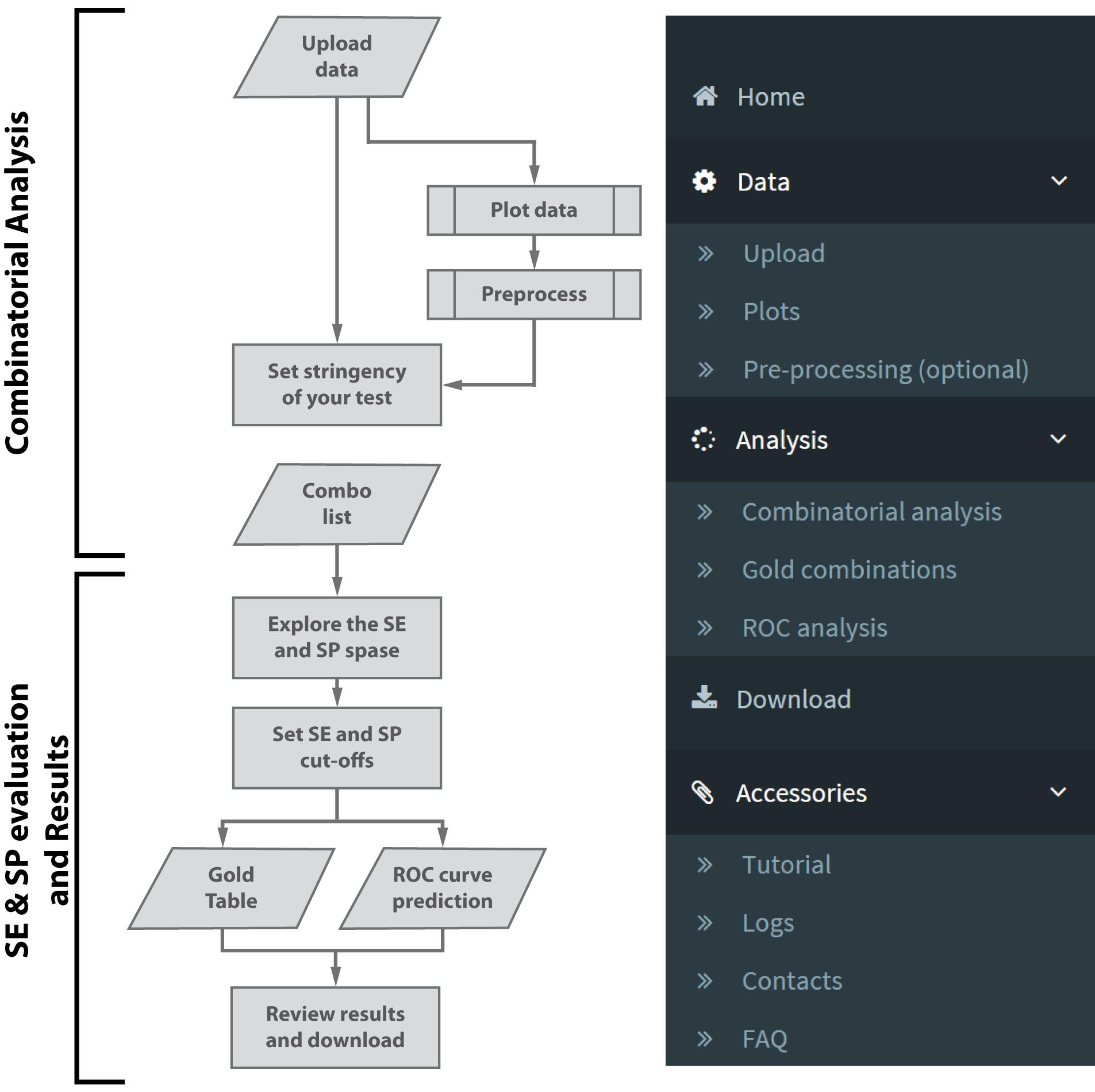
CombiROC delivers a simple workflow to help researchers in selecting the optimal combination(s) of markers through a simple analytical method based on the introduction of a double filter scoring. Figure 1 , left, illustrates the general workflow of the application: after uploading multi markers profiling data in text format, users are offered a choice of simple data viewing with plotting and optional data processing methods. Users can define the stringency of their test (i.e. the signal cutoff and minimum number of positive features). Then, thresholds on sensitivity (SE) and specificity (SP) can be freely explored and interactively adjusted graphically observing how many markers’ combinations survive the cutoffs; finally, the best combinations can be chosen and their ROC curves automatically generated. Users can review results and download combinatorial analyses results and ROC curves.
CombiROC’s analytical approach is based on sensitivity and specificity filters, interpreted in terms of recognition frequency, optimizing the number of potentially interesting panels rising from a previous combinatorial analysis step. CombiROC does not take for granted a default algorithm-driven marker threshold, but it allows users to interactively choose the thresholds according to their requirements: in doing so it dramatically reduces the computational burden for the subsequent analytical steps. CombiROC also makes the analysis of biomarkers panels of diverse nature easier, lowering false negative rate given by fixed thresholds.
Paragraphs of this tutorial are ordered following the structure of the application's main menu ( Figure 1 , right).
This tutorial can be downloaded as single PDF file here .
Data can be uploaded to the CombiROC application. Before being uploaded the data in the application, data need to be correctly formatted as text files (csv, tab or semicolon separated). Make sure you are using the English locale for decimal separators (use the dot "." to separate decimals in numerical fields).
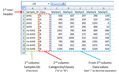
You can prepare your data in your favorite spreadsheet software or application as long as it contains (see Figure 2 ):
- in the first column, the samples IDs (i.e. patients),
- in the second column, the class category (i.e. disease and healthy; marked "A" and "B")
- from the third column onward, the data values (i.e. detection levels)
The first row can contain a header. An example is given in Figure 2 and a preformatted demo file can be also downloaded here .
- the header of the first column must be "Sample_ID"
- the header of the second column must be "Class"
- the header of columns from the third onward must be "Marker#", where "#" is a progressive integer (i.e. Marker1, Marker2, Marker3,....).
In the second column, dedicated to the classes/categories of samples (i.e. healthy and diseases; treated and untreated) an arbitrary number of classes are accepted in the file but the application will consider for the analyses only the first 2 classes for pairwise comparisons . Thus, for clarity we recommend to limit in the uploaded file the number of classes to 2, tagged with "A" and "B".
Once your data are correctly formatted you can upload them using the "Data / Upload" link in the main menu on the left: in the "Enter data" widget select the "Upload file" option then select the file from your workstation. In case it’s not automatically recognized, you can indicate the presence or absence of the header and specify the separator used (comma, semicolon or tab). From the very same menu you are also offered the possibility to use the pre-loaded demo data choosing the "Load demo data" options.
Immediately after loading the data, they will be visualized in a tabular form in the "Table" widget on the right; if the data are correctly formatted you will be able to see the header and data as they appear in the original file. Only the first ten entries (rows) are displayed by default but you can adjust this number with the upper left selection in the Table widget.
The displayed rows can be copied, downloaded as csv, or as pdf clicking on the "Copy","CSV" or "PDF" buttons respectively, on the upper right corner of the widget. Please note that only entries displayed on screen will be downloaded or printed, so if you want the entire file to be downloaded make sure to select all entries with the "Show ALL entries" toggle selection on the left.
The widget "Details of uploaded dataset" will summarize some details of your data: the number of samples, markers and categories, the data value’s type and the presence of missing values. If errors are detected a warning will be displayed in this widget.
The Plots page of CombiROC automatically displays two types of plots and statistics overview of the uploaded data. Upon clicking to the Data / Plots menu, ancillary options become active on the lower bottom of the main menu: they are "Display" , used to choose from two different type of plots (box plot and marker profile plot), and "Options" (available for the box plot only) used to change data, display and label options of the box plot.
Among the options that can be changed for the box plot type are the whisker type, the color of boxes, the orientation, height and width of the plot. The Y-axis ranges of the two classes’ plots are scaled individually by default, according to minimum and maximum values in the dataset. If you need to have box plot panels in the same range you can adjust this range in the "Adjust Y-axis range" field typing it in the format "0,1000" (lower value - comma - upper value). Beware that adjusting Y-axis range the value extremes could be not visualized. Finally, labels can be edited with custom text and font size.
The box plot is used to visualize the distribution of single markers values across the samples (i.e. patients). Upon loading the demo data two box plots are obtained colored in red-pink for Class A and blue for Class B; markers are visualized in each class and their distributions observed.
In the box plot page is also visible the "Box plot statistics" tables for both classes: they include distribution parameters which allow the user to choose the best cutoff values for the subsequent step (combinatorial analysis).
The marker plot displays the signal intensity of each single sample for each marker. Select the marker you want to display from the drop down menu on the left, click on "plot graph" and the profile plot will be displayed. You then can hover over data points to reveal single samples details.
In this page data can be processed with a few transformations if they need to be reshaped. From the drop down menu you can choose among a data transformation (log2 transformation), and two methods of scaling (unit variance scaling; pareto scaling).
The "unit variance scaling", also known as autoscaling is commonly applied and uses the standard deviation as the scaling factor; in the "pareto scaling" the square root of the standard deviation is used as the scaling factor instead.
On the right side of the page the transformed and/or scaled data are displayed in tabular form. As for the other tables visualized in the application, only the first ten entries (rows) are displayed by default but you can adjust this number with the upper left selection in the Table widget.
PLEASE NOTE: CombiROC is neither a transformation nor a data visualization tool: the steps "Plots" and "Preprocessing" are not strictly necessary for the completion of the analysis. The "Plot" function and the optional transformation tools are meant to allow users to look their data's structure, but data themselves should be correctly formatted before being uploaded to CombiROC.
The Combinatorial Analysis, also called combinatorics, is a branch of mathematics concerned with the theory of enumeration, or combinations and permutations, in order to solve problems about the possibility of constructing arrangements of objects which satisfy specified conditions.
In the page "Analysis / Combinatorial Analysis" you will find tools to obtain all possible markers combinations and choose the best one, i.e. the one with the higher response. Three main widgets " Graphics ", " Mathematical details " and " Combo List " are describe below.
In the "Graphics" widget you can set, according to the specific nature of your experiment (the test), the cutoff above which the features' values are considered positive (the " test's signal cutoff "); you can also insert the minimum number of positive features that need to reach the previously set cutoff.
As an example, upon loading the "Demo data (proteomics)" provided by the application you will find the pre-set cutoff value of "450" (e.g. Fluorescence Intensities, representing the mean value of buffer control class plus three times the standard deviation). The minimum number of positive features is, for the demo data, pre-set to "1", i.e. with the minimum stringency, which means that at least 1 marker must reach the value of 450.
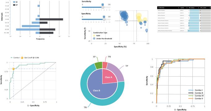
Once you have set the proper thresholds click on the " Distribution " button to visualize in an histogram graph the distributions of Sensitivity and Specificity of the combinations satisfying the set cutoffs ( Figure 3 : Sensitivity (SE, blue bars) is defined as the true positive rate in percentage of your sample. Specificity (SP, black bars) is defined as the true negative rate in control class in percentage. In x-axis is shown the number of each positive feature as frequency (left wise blue bars for SE intervals, right wise black bars for SP intervals) while in y-axis the SE and SP distributions intervals in percent. You can hover over bars to see values.
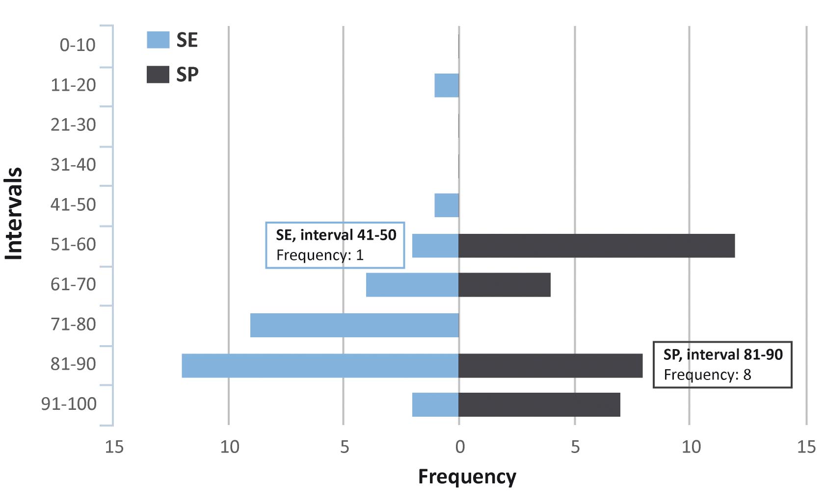
This histogram plot helps the user to evaluate the intervals from which the best SP/SE values will be chosen, and on which markers’ " Gold Combinations " will be calculated in further steps of the analysis. In the specific "Demo data (proteomics)" example, to which the plot in Figure 3 refers, the graph shows that most markers’ combinations have sensitivity higher than 40%, with a peak of 12 combinations in the 81-90% sensitivity range; for the specificity distributions all combinations have SP higher than 50% and a substantial number of them are above 80%. Any evaluation and choice at this point is strictly dependent on the specific nature of the experiment that generated the data and on the aim of the user: using the demo data as an example the preloaded values of sensitivity >40% and specificity >80% can be found, since they may serve the purpose of a usable tradeoff with the data at hand.
Once these "hard" thresholds are set, further browsing and evaluation of sensitivity and specificity values can be done in the subsequent "Gold combinations" section.
In this widget is shown the formula used for the combinatorial analysis:
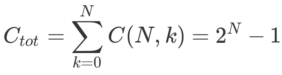
N= the total number of items; k= the desiderate number of components in the combination. For more theoretical details see: Introductory Combinatorics (5th Edition), Brualdi RA.
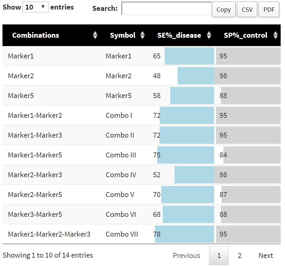
The table in the "Combo List" widget shows a numerical overview of the sensitivity and specificity of combination of markers thereof according to the thresholds set in the "Graphic" widget. In the "Demo data (proteomics)" example the table shows the sensitivity and specificity values of 31 features, a list that includes each marker and all possible combinations generated using the pre-set threshold (at least 1 feature with ≥ 450 detection, i.e. at least 1 feature with "positive" value).
Once the hard thresholds ( i.e. cutoffs on detection value and minimal number of markers) have been set, the array of obtained markers’ combinations ("Combos") can be more deeply evaluated in order to select only the few (the Gold ones) that satisfy a minimal SP and SE.
In this section two sliders are available to explore the SE and SP ranges. On the Bubble chart on the right of the page sensitivity (Y axis) and specificity (X axis) of all the marker combinations are automatically plotted; the size of the bubbles is proportional to the number of markers in the combo, the bigger the bubble, the more the markers. Combinations that do not bypass the SE & SP thresholds set with the sliders on the left are depicted as blue bubbles (the "under the thresholds" combos), otherwise the bubbles are yellow (the "Gold" combos). To start off, you can move the sensitivity and specificity sliders and observe how many bubbles (=markers combos) remain yellow at higher SE and SP values.
Once you reach a reasonable tradeoff between SE, SP and number of combos to go further in the analysis you need to confirm SE and SP values in the "Gold Table" section, in the lower half of the page (you’ll notice that SE and SP values set with the sliders are automatically reported in the "Gold Table" section below, for the "Demo data (proteomics)" values of 40% Sensitivity and 80% Specificity are suggestsed and preloaded). Click on "Submit" and a table detailing - and naming - the selected combinations will be displayed in the lower right of the page Figure 4 . This table lists each single marker and/or combination of markers that have been selected from the values of Specificity and Sensitivity used. Using the "Demo data (proteomics)", and the preloaded SP and SE values (see also discussion in the previous section "Combinatorial Analysis"), 14 combinations out of the 31 in the original input list are selected and consequently displayed in the gold table: this table displays the percentages of Specificity and Sensitivity corresponding to each marker or combination. As other tables in the application, this one can be copied and downloaded as a csv or pdf file.
After having set all the thresholds on your dataset and obtained a number of "Gold combinations" of markers, then you finally need to see how these combinations perform. Receiver operating characteristic (ROC) curves are used in medicine to determine a cutoff value for a clinical test. When creating a diagnostic test, a ROC curve helps us visualize and understand the tradeoff between high Sensitivity and high Specificity when discriminating between clinically "normal" and clinically "abnormal" laboratory values.
First, you have to select from the drop down menu the single combination to visualize the corresponding ROC curves. If you want to directly compare multiple markers or combinations in the same plot thick the "Check to plot multiple curves" mark (see further). The names of markers and combinations in the drop down menu ("Marker#" if single markers or "Combo" followed by roman numeral) are the same as those reported in the "Gold table" in the previous page of the workflow.
Once you select a marker/combo from the dropdown, the ROC curve, Predictions and Performance Analysis are automatically visualized.
The ROC curve (
Figure 5
) is a graph of "sensitivity" (y-axis) vs "1 – specificity" (x-axis). Large "y" values on the ROC curve plot correspond to higher sensitivity, while small "x" values correspond to higher specificity. The shape of the curve depicts the combinatorial variation of these two important parameters. Below the ROC curve you will be able to see the AUC (Area Under the Curve), SE, SP and optimal cutoff numerical values of the analyzed combo in tabular form.
The results are reported in fractions from 0 to 1. A diagonal line of identity is reported such as the point of optimal cut-off. However, you can choose whether to display it or not, just by clicking on it.
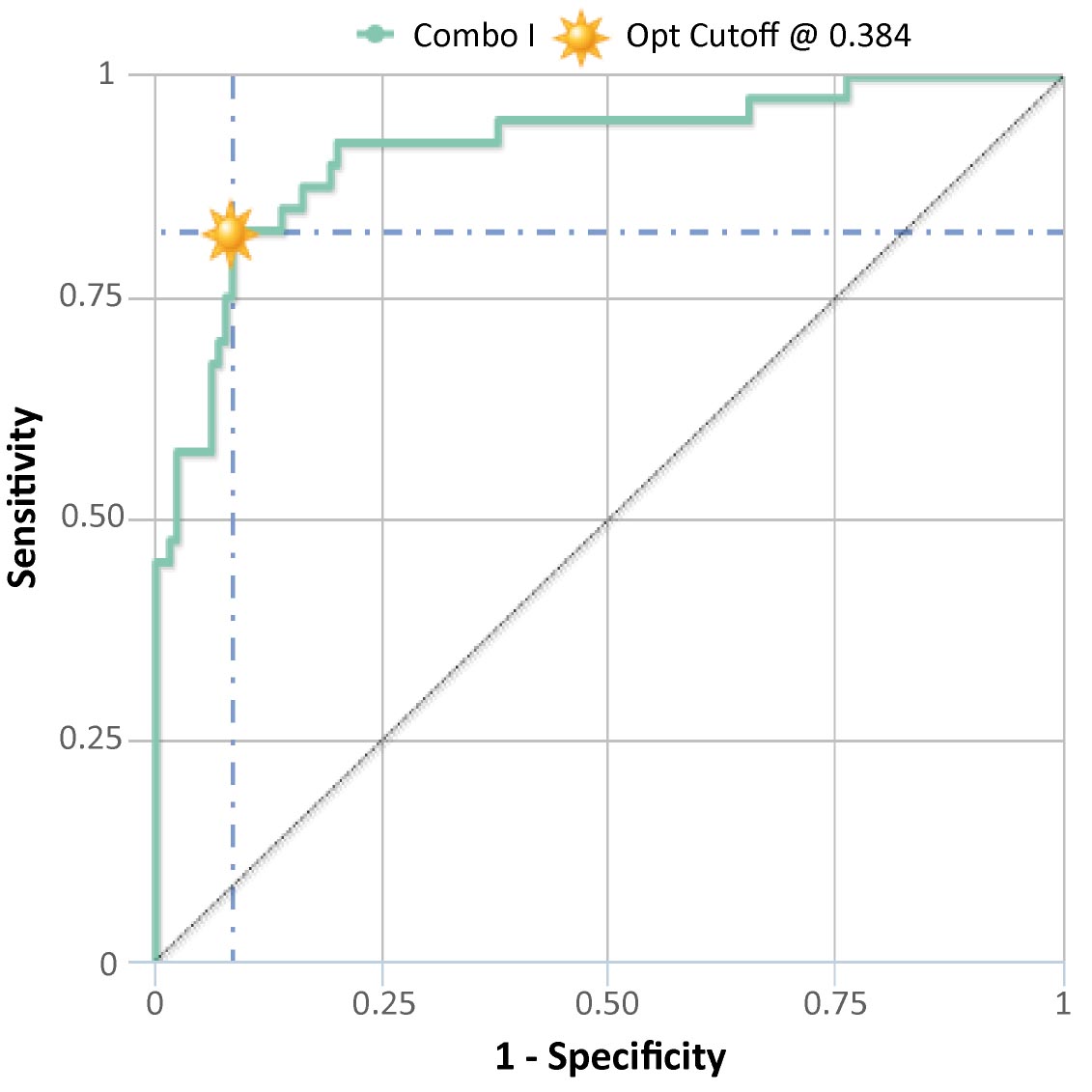
Figure 5 shows the ROC curve of "Combo II" obtained using the "Demo data (proteomics)". A table for each single marker or combo that have been selected from the marker dialog, will also appear below the plot, showing the values of Area Under Curve, Sensitivity, Specificity (in percentage) and Optimal cut-off. As other tables/figures in the application, this one can be copied and downloaded as a csv or pdf file.
The "Predictions" section of the page displays a violin plot and a pie chart.
The violin plot is a combination of a box plot and a kernel density plot, showing the "probability density" of the data at different values. Prediction probabilities are plotted for both classes (class A and B, disease/healthy, treated/untreated) according to the previously obtained optimal cutoff. The four possible categories are then visualized: False Negative (FN); False Positives (FP); True Negative (TN); True Positive (TP). This plot helps to visualize the proportion of samples falling in the four possible quadrants, especially in those of the TN and TP predicted categories, in order to evaluate the goodness of the underlying markers.
The pie chart shows the very same information in a different way. In this plot can be easily visualized which fraction of false predictions (false positive or false negative) there are in each class (class A/B, disease/healthy) as opposed on how big is the fraction of true predictions and inside the total fraction of markers in each class. Obviously the smaller the false predictions fractions, the better performing is the marker or the combination.
In the lower section of the page the same ROC curve of the selected combo is overlaid with the corresponding Cross Validation (CV) in order to evaluate its performance. The table below this last plot reports the accuracy (ACC) and error rate of the whole cohort and 10-fold CV, as well as the corresponding sensitivity (SE), specificity (SP) and Area Under the Curve value (AUC).
If you want to visualize and compare ROC curves of multiple markers and combinations among those selected in the Gold table you need to check the "Check to plot multiple curves" tick mark in the "Select Combos" widget at the top (upper left) of the page.
In the drop down selection menu you will be able to choose, one after the other, all the single markers and/or combos in the gold table that you want to compare: a graph of overlaid ROC curves will be automatically displayed in a single plot. Below the graph SE, SP and AUC for each curve will be reported in a tabular form. As other tables/figures in the application, this one can be copied and downloaded as a csv or pdf file.
Please note that prediction and performance analyses as described before are available for single markers or combinations only, not when multiple markers/combos are compared in the same ROC curve plot.
In order to test the statistical significance of AUC value you can hit the "Check to perform permutation test (single curves only)" tick mark in the "Select Combos" widget at the top (upper left) of the page.
In the drop down selection menu you will be able to choose a marker (single markers or combos) in the gold table that you want to verify and a graph will be displayed. This plot shows the density plot of the AUC values in the analysis of 500 permutation test and the grey line the real AUC value. The table below the plot reports the accuracy (ACC) and error rate of the whole cohort and the permutated models, as well as the corresponding sensitivity (SE), specificity (SP) and Area Under Curve (AUC).
In this section you can download the tabular file of the "demo data" and a printable pdf file of the tutorial.
This section describe how to use CombiROC step by step. Real dataset is used as example as "Demo data (proteomics)". The demo dataset is obtained from Mazzara et al. 2015, PLos One 10(9):e0137927 and can also be downloaded from the "Download" section of the application.
Other "Demo data (transcriptomics)" available on the CombiROC website are obtained from Baraniskin et al. 2011, Blood 117(11):3140-6.
This section contains the version history of the CombiROC web application. All relevant changes and upgrades will be reported here in the future.
This application was created by the Protein Microarray and Bioinformatics units at Istituto Nazionale Genetica Molecolare "Romeo ed Enrica Invernizzi" (INGM), Milan, Italy.
If you have questions or comments, please contact Saveria Mazzara at saveria.mazzara@gmail.com This application was implemented using Shiny (for web interface) and other R packages (for data manipulation).
In this section frequently asked questions on the application and its usage will be added as soon as they will be available.
Mazzara S et al. CombiROC: an interactive web tool for selecting accurate marker combinations of omics data. This application was created by the Protein Microarray and Bioinformatics units at INGM. If you have questions or comments, please contact Saveria Mazzara (saveria.mazzara(at)gmail.com). This application was implemented using shiny (for web interface) and other additional R packages (for data manipulation).
Logs
Version History
Current version of CombiROC is v.1.2 ( February 10th, 2017 ): expanded the app in the "ROC analysis" step with the permuatation test, few bugs fixed.
CombiROC v.1.1 ( December 22nd, 2015 ): added multiple curves plotting functionalities, few bugs fixed.
CombiROC v.1.0 ( September 7th, 2015 ): first web version running on Shiny server.
Mazzara S et al. CombiROC: an interactive web tool for selecting accurate marker combinations of omics data. This application was created by the Protein Microarray and Bioinformatics units at INGM. If you have questions or comments, please contact Saveria Mazzara (saveria.mazzara(at)gmail.com). This application was implemented using shiny (for web interface) and other additional R packages (for data manipulation).
Contacts
Istituto Nazionale Genetica Molecolare "Romeo ed Enrica Invernizzi"
This application was created by the Protein Microarray and Bioinformatics facilities at Istituto Nazionale Genetica Molecolare "Romeo ed Enrica Invernizzi" (INGM), Milan, Italy.
Bioinformatics- Unit
The Bioinformatics unit is a team of professional scientists focusing on study, development, and optimization of tools for the analysis of genomic data generated by INGM scientists. Our mission is to work closely with the Institute’s programs facilitating access to biological data analyses and elaborations to all research groups, while supporting translational research with standard analytical expertise and providing access to up-to-date and novel analytical methods.
Protein Microarray- Unit
The Unit provides access to Protein Microarray for biomedical research. The provided services cover all the main needs of basic and advanced research by using Protein Microarray.The major objectives of the facility are:
- Set up, maintain and develop Protein Microarray Technology for basic and advanced research.
- Provide protein spotting, as such as antigens, antibodies for, extract cell for INGM researchers and external collaborators.
- Directly provide sample spotting and analysis in specific applications for INGM researchers and external collaborators.
- Provide on-site training and assistance to prepare biomedical researchers to the use of instrumentations and to introduce to protein microarray applications.
- Perform independent and collaborative research for the development of advanced protein microarray protocols.
- Perform collaborative research with INGM groups where highly specific protein microarray platform competences are required.
Developers
- Saveria Mazzara, PhD
- Riccardo L. Rossi, PhD
- Mauro Bombaci, PhD
Contact
We welcome your feedback. If you have suggestions for improvements, questions and difficulties, please contact Saveria Mazzara at saveria.mazzara@gmail.com
Mazzara S et al. CombiROC: an interactive web tool for selecting accurate marker combinations of omics data. This application was created by the Protein Microarray and Bioinformatics units at INGM. If you have questions or comments, please contact Saveria Mazzara (saveria.mazzara(at)gmail.com). This application was implemented using shiny (for web interface) and other additional R packages (for data manipulation).
FAQ
Q: Can I use combiROC to screen for biomarkers?
CombiROC is not a screening tool. You should be able to select your potential biomarkers using traditional screening methodologies such as differential expression for genes, microRNA or proteins by arrays, sequencing or mass spec. Once you have shortlisted a number of potential biomarkers, i.e. your "signature", you can explore the performance of their combinations with CombiROC
Q: How many biomarkers can CombiROC handle?
There is no theoretic limit to the number of biomarkers. Practically a limit is imposed by computational load given by big numbers: "n" markers can combine in "2^n -1" way (i.e. 31 combinations of 5 markers; 1032 combinations of 10 markers; more than 1 nonillion combinations for 100 markers). Thus CombiROC best performs for marker lists composed of up to 10 markers, which is a reasonable and sufficiently high number of potential biomarkers in the clinical practice.
Q: Are there hard thresholds to set up?
There are no mandatory hard threshold to set up after uploading the data. Nevertheless, the application asks the user to "set the test signal cutoff" (in the Analysis / Combinatorial analysis step), which is strictly inherent to each and every dataset uploaded and is aimed at eliminating the noise from the signal under the technical detection thresholds given by the specific experimental methods used. The user can virtually set this threshold equal to the minimum value in the dataset (no zeroes are allowed) or, better, extimate a "true" signal value observing the value distributions in the box plot panels and the relative box plot statistics generated by the app after the data have been uploaded.
Q: When should I use the preprocessing tab?
The choice of data prepreocessing depends on the biological/clinical data under investigation. In general, the aim of this optional step is to facilitate data analysis and model intepretation removing instrumental noise and making the measurements of the samples comparable.
- For example, a variable/biomarker could contain one or few extreme measurements which may dominate over the other measurements; in other words, this variable/marker departs from normality. One way to achieve a more symmetric data distribution is by transforamtion such as the "log-transformation".
- Data scaling is equivalent to giving all of the variables equal importance, hence this procedure could be particularly useful in "omics" datasets where variables are characterized by large scale effects. There are nmany ways to scale the data, but the most common technique is the "unit variance" or the "pareto scaling".
Q: Can I customize the name of markers in the header of my file?
Unfortunately, not yet. This first public version of CombiROC is able to correctly handle only datasets whose markers in the header are named with "Marker1", "Marker2", ... , "MarkerN".
Q: What happens if I don't put any SE/SP cutoff in the Gold Combination bubble plot step?
You do not necessarily have to raise the SE/SP filtering cutoffs in the gold combination step. If you don't put any cutoff all the possible combinations will be considered as "gold" and will be taken further in the analysis. Raising the cutoffs allows you to shortlist to the best performing ones.